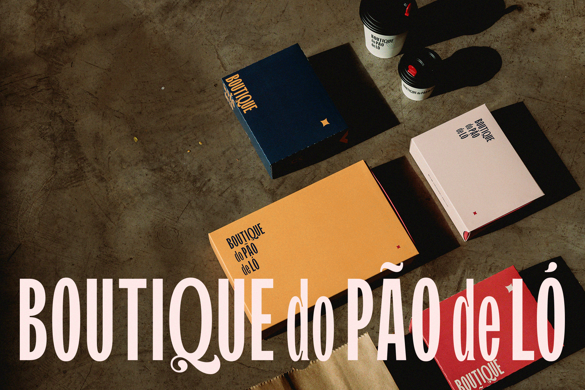
From tradition to expansion: how we revived the essence of Boutique do Pão de Ló to shape the brand’s future
Boutique do Pão de Ló is a confectionery from Santa Catarina that has become a regional reference in the Vale do Itajaí area. In 2023, it celebrated 10 years of history and began a new chapter with the goal of expanding its business through a franchise model. To achieve this objective, a series of strategic updates were necessary, including brand repositioning, modernization, and the development and standardization of its visual identity.
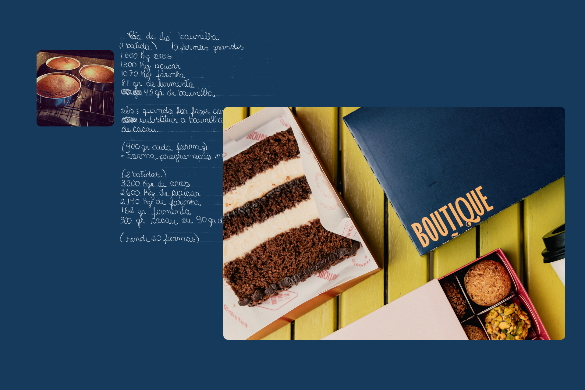
As a well-established brand in the region, we recognized the importance of revisiting its journey, bringing back visual, textual, and verbal elements used throughout the past decade. Based on this reflection, we carried out updates aligned with the new phase of Boutique do Pão de Ló, ensuring the brand’s expressions remain authentic and deeply connected to its essence.
Da tradição à expansão: como resgatamos a essência da Boutique do Pão de Ló para projetar o futuro da marca.
Boutique do Pão de Ló é uma confeitaria catarinense que se tornou referência na região do Vale do Itajaí. Em 2023, completou 10 anos de história e iniciou um novo ciclo com o objetivo de expandir seus negócios por meio do modelo de franquias. Para alcançar essa meta, foi necessário implementar uma série de atualizações estratégicas, que envolveram reposicionamento de marca, modernização, desenvolvimento e padronização das suas expressões visuais.
Por se tratar de uma marca já consolidada na região, identificamos a importância de resgatar sua trajetória, revisitando elementos visuais, textuais e verbais utilizados ao longo dessa década. A partir desse resgate, realizamos atualizações alinhadas à nova fase da Boutique do Pão de Ló, garantindo que as expressões da marca permanecessem autênticas e profundamente conectadas com sua essência.
subtle details that speak
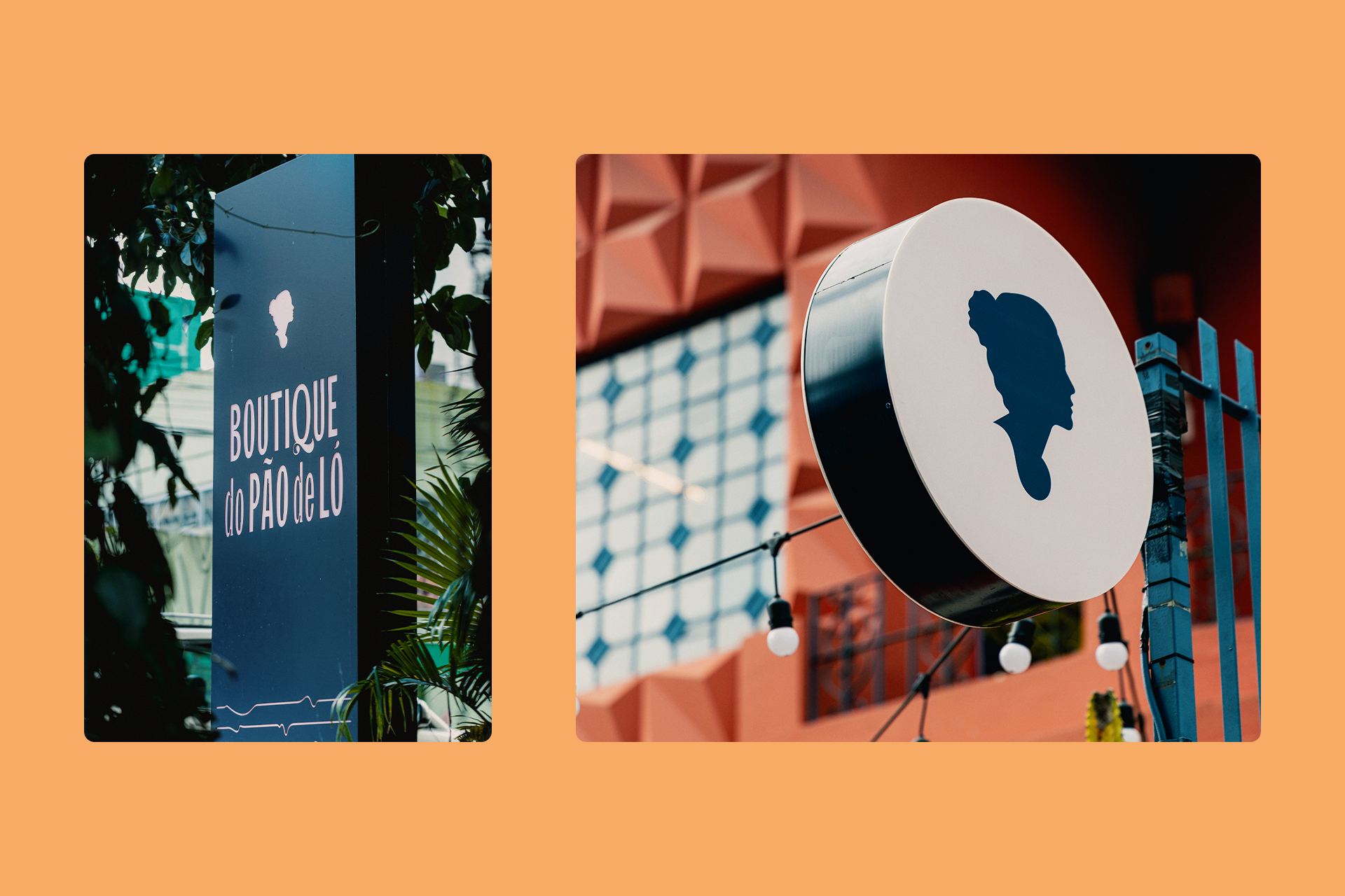
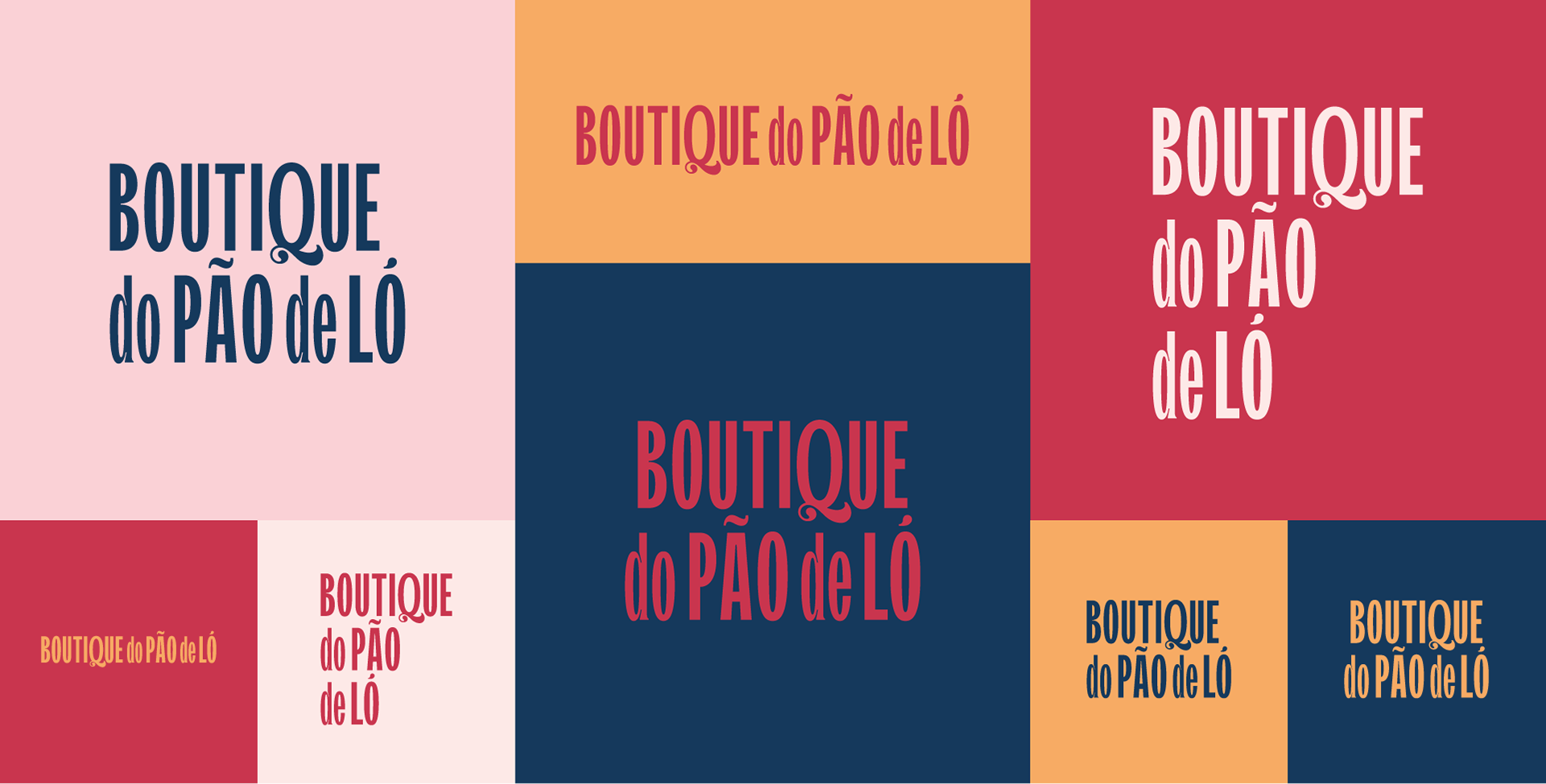
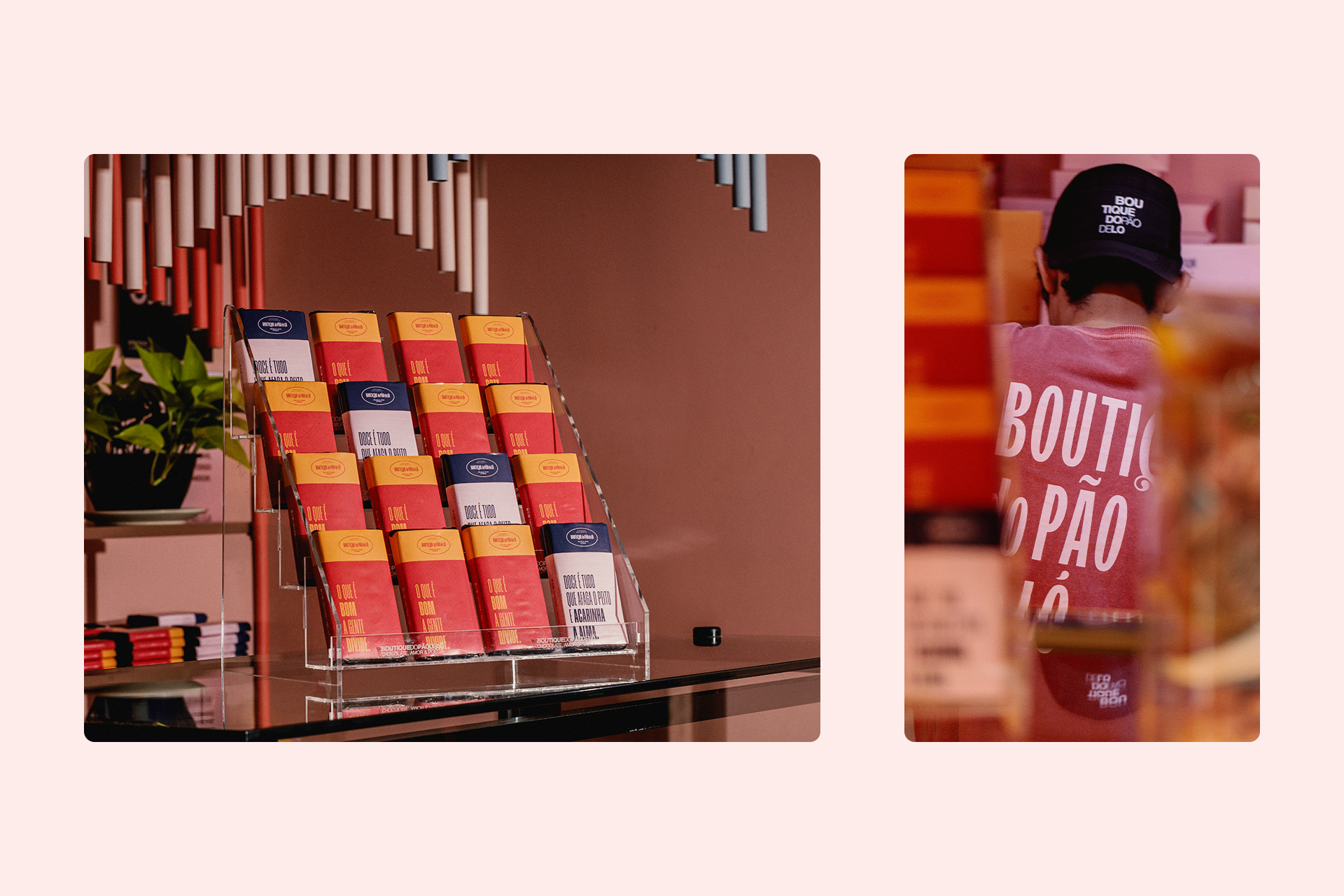
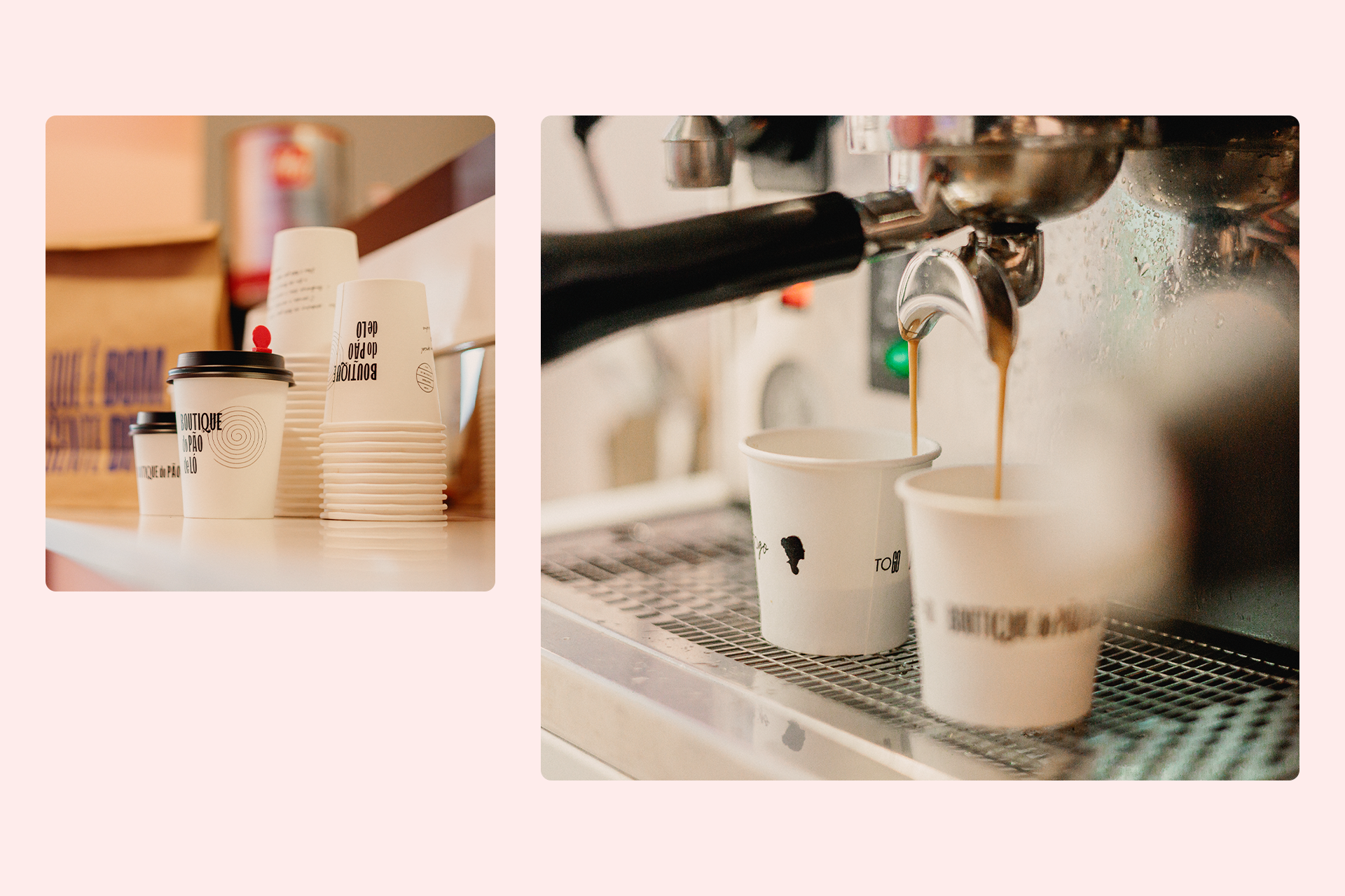
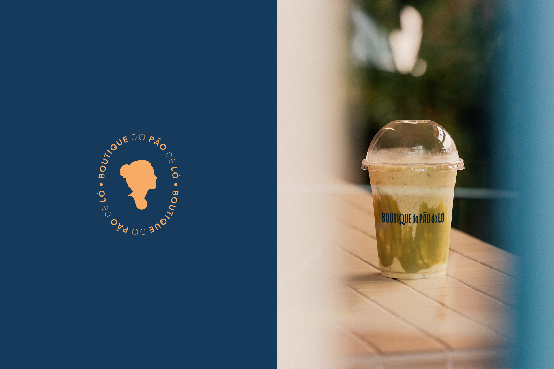
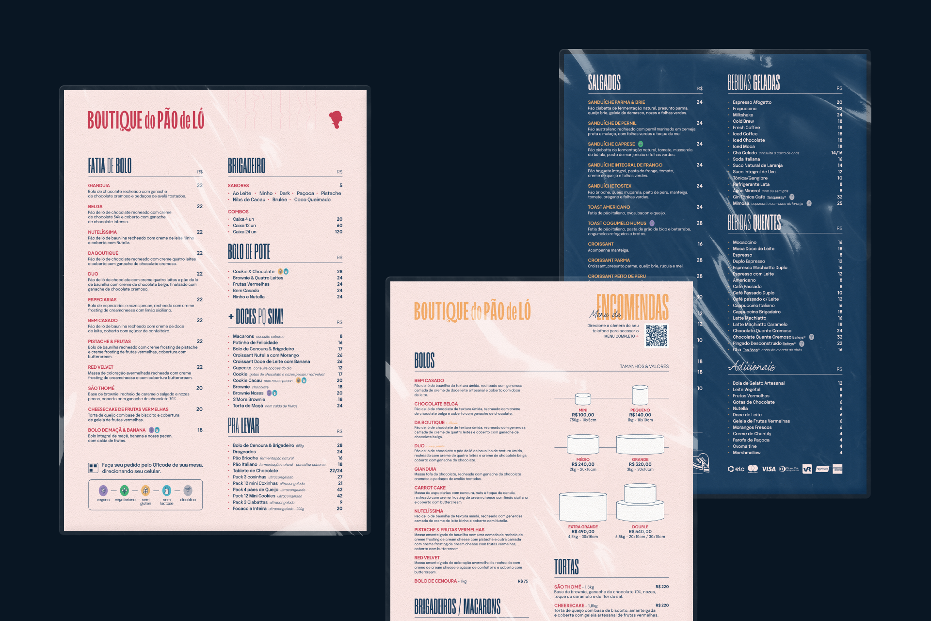
When it came to visual identity, we identified a challenge: although the name Boutique do Pão de Ló is strong, its length posed limitations in various applications. With this in mind, we redesigned the typography, opting for a more condensed version. We also explored typographic details such as inktraps and the tail of the letter “Q,” giving the brand more personality and versatility across different applications.
sutilezas que falam
No que diz respeito à identidade visual, identificamos um desafio: o nome Boutique do Pão de Ló, apesar de forte, é extenso e apresentava limitações em suas aplicações. Pensando nisso, redesenhamos a tipografia, optando por uma versão mais condensada. Também exploramos detalhes tipográficos como inktraps e a cauda da letra "Q", conferindo à marca mais personalidade e versatilidade nas aplicações.
No que diz respeito à identidade visual, identificamos um desafio: o nome Boutique do Pão de Ló, apesar de forte, é extenso e apresentava limitações em suas aplicações. Pensando nisso, redesenhamos a tipografia, optando por uma versão mais condensada. Também exploramos detalhes tipográficos como inktraps e a cauda da letra "Q", conferindo à marca mais personalidade e versatilidade nas aplicações.
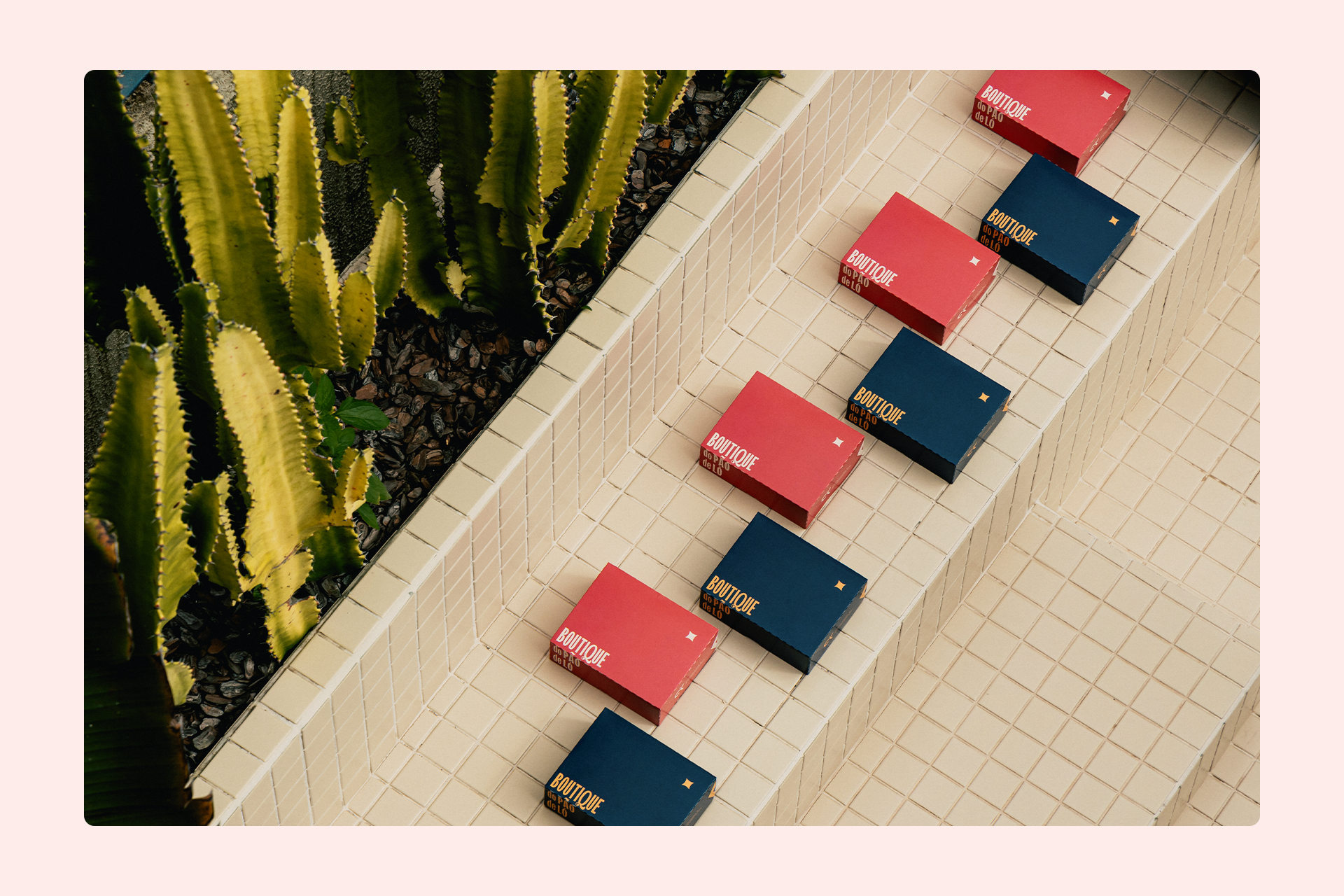
expanded visual universe
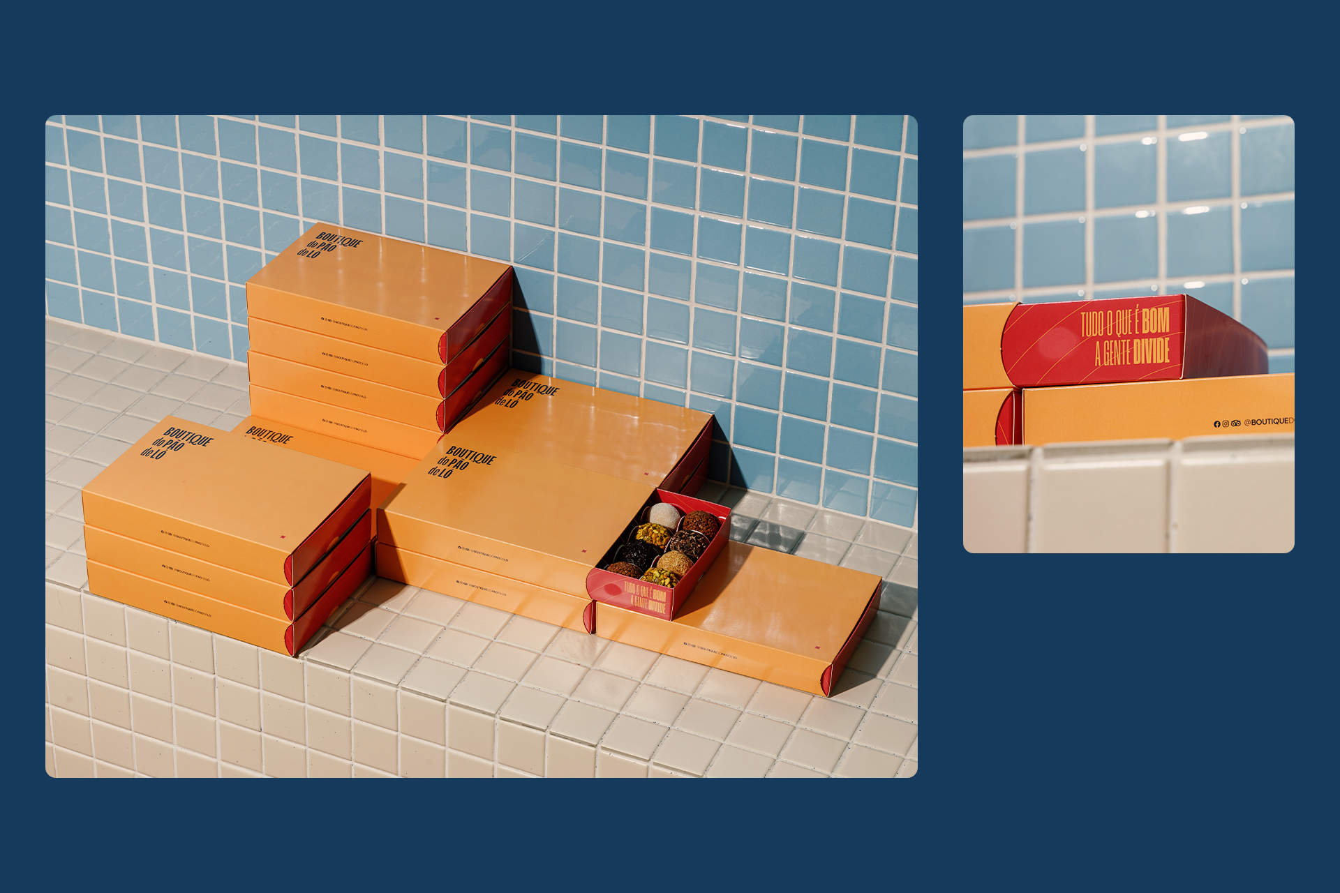
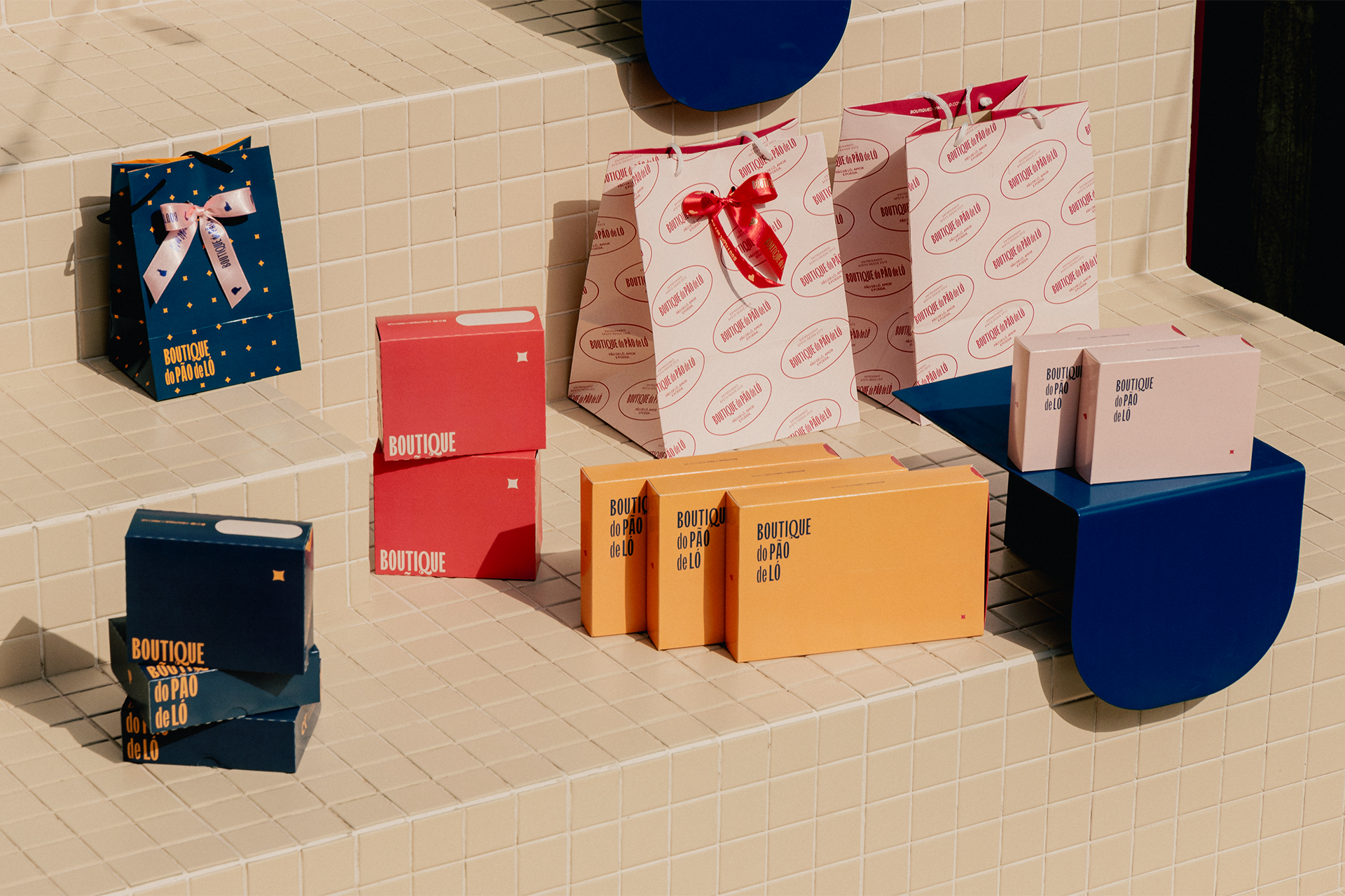
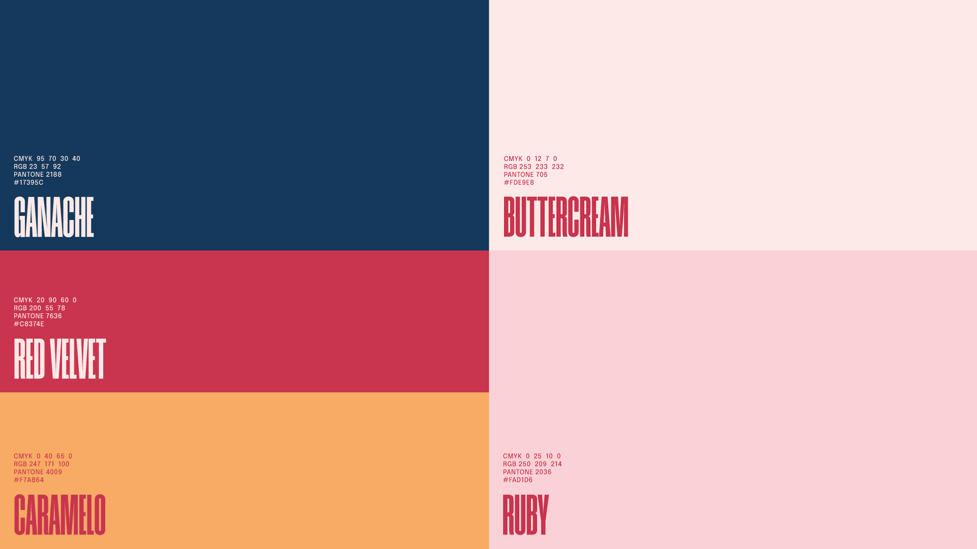
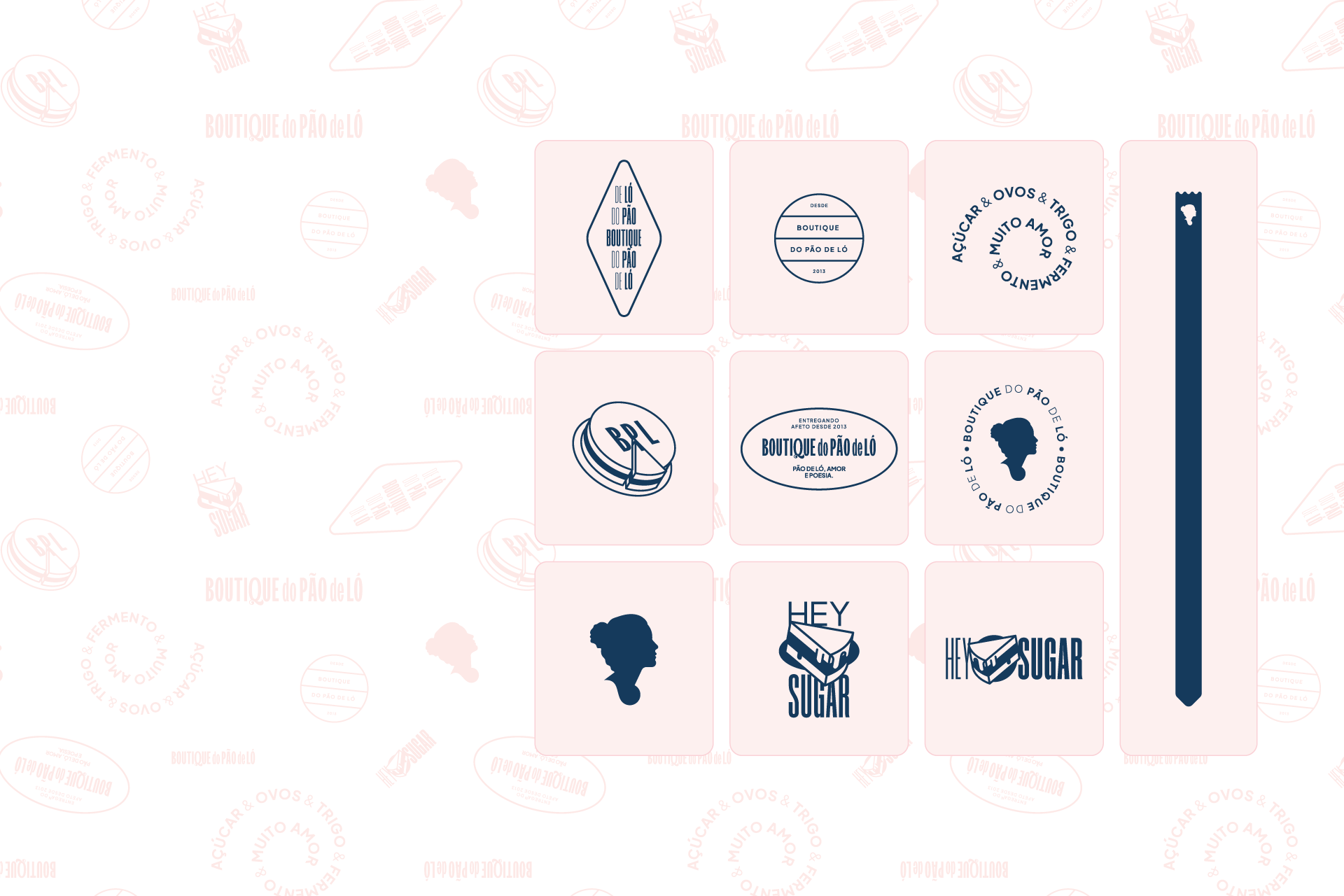
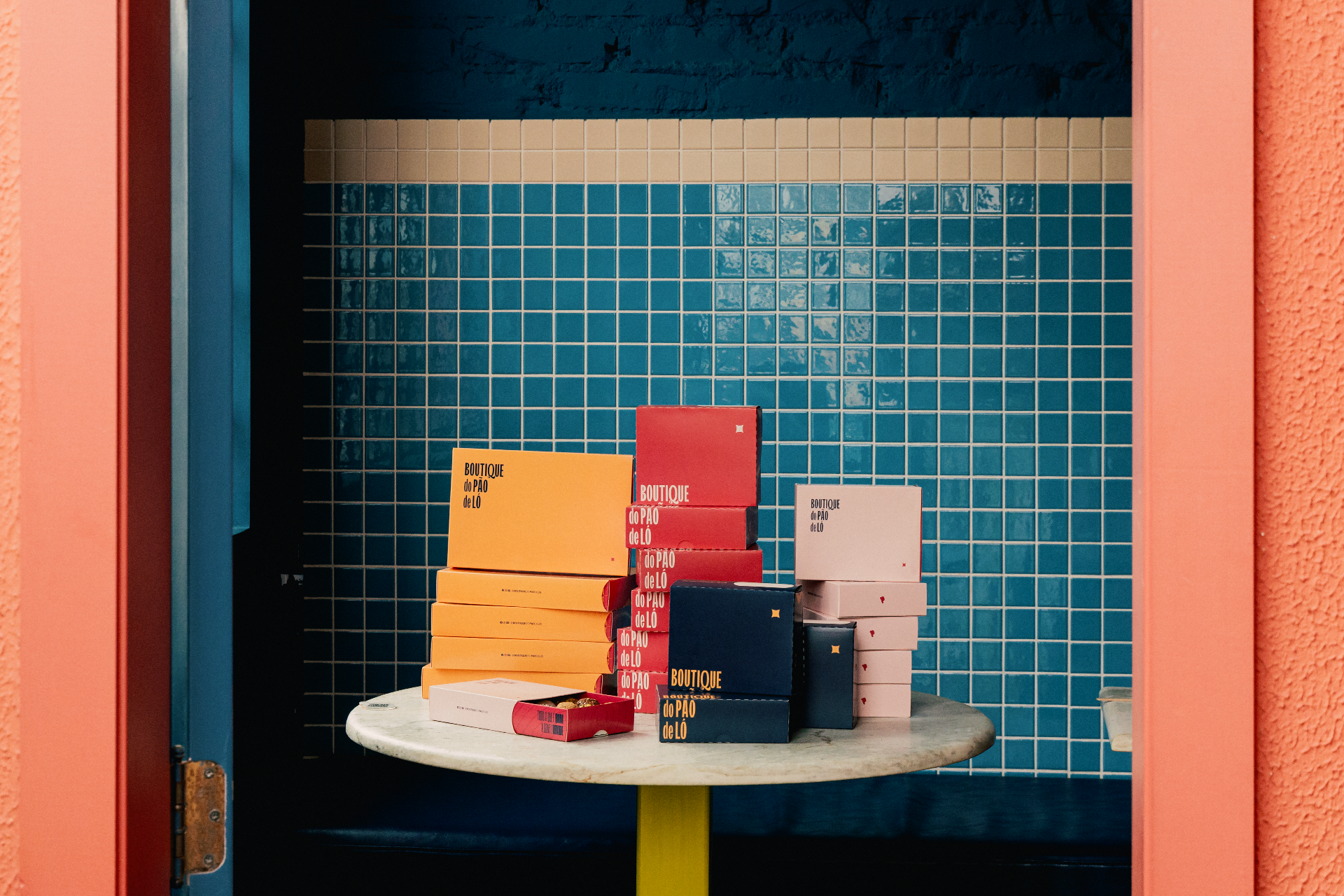
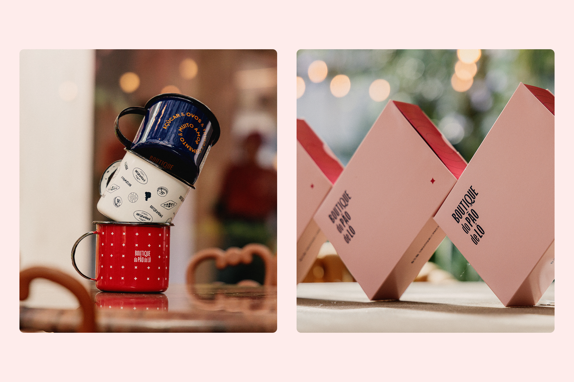
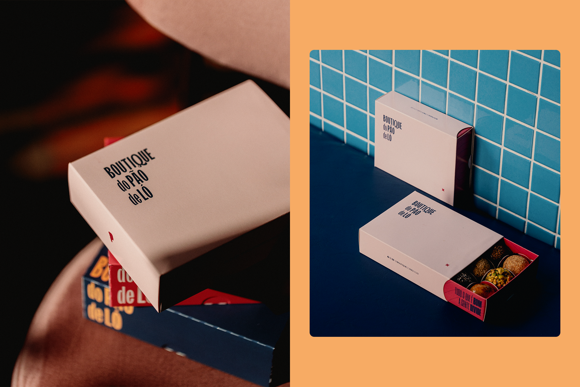
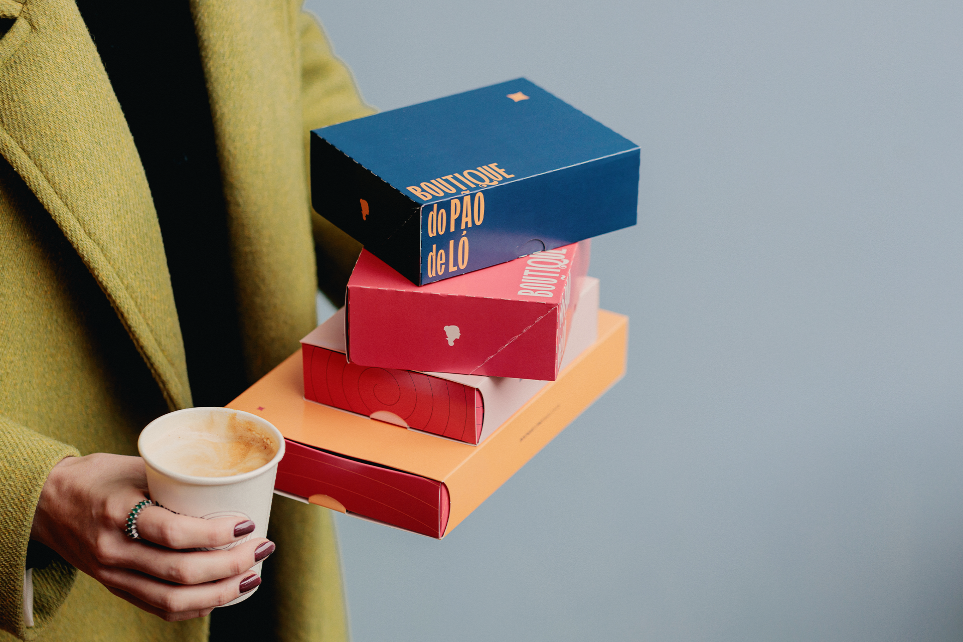
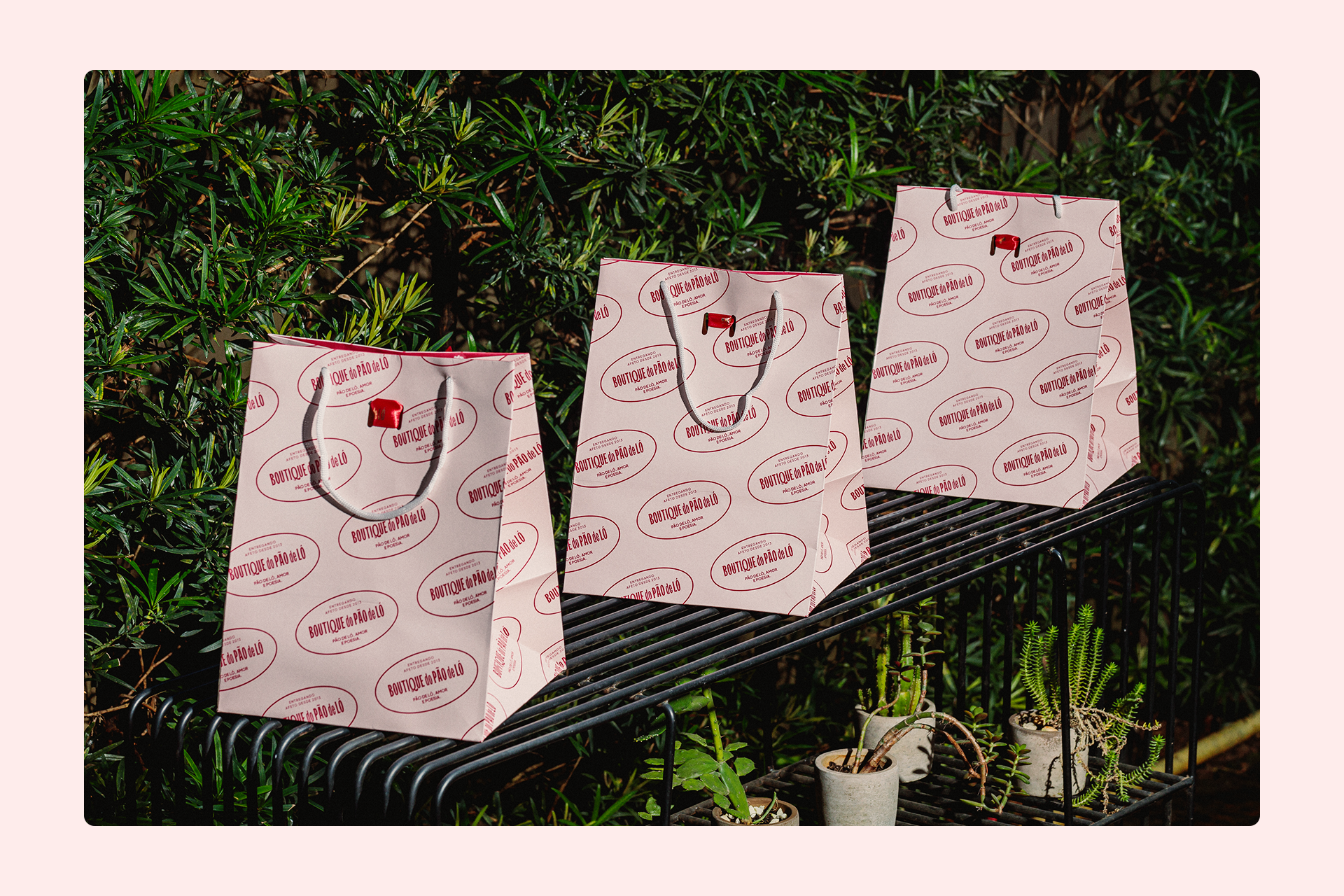
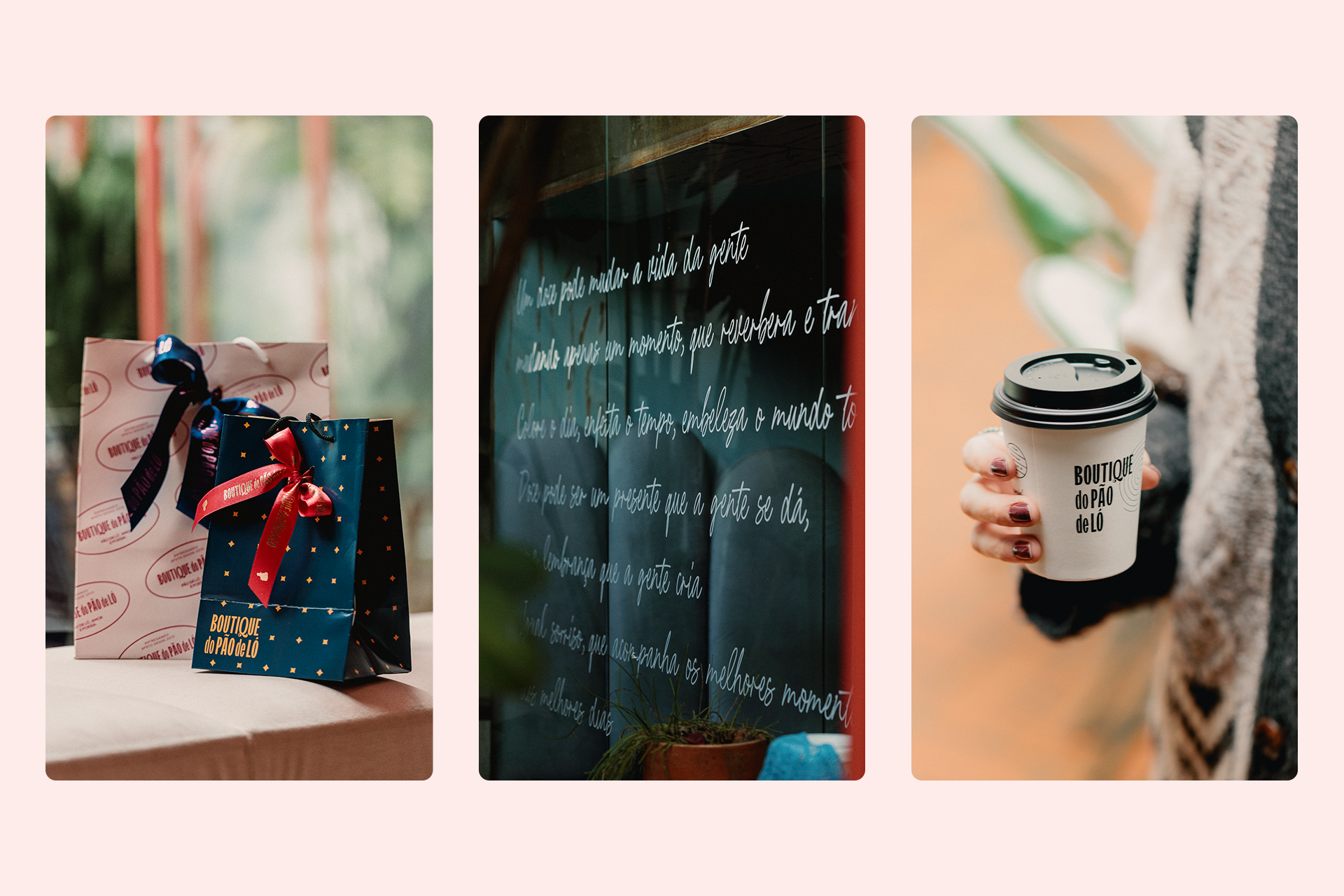
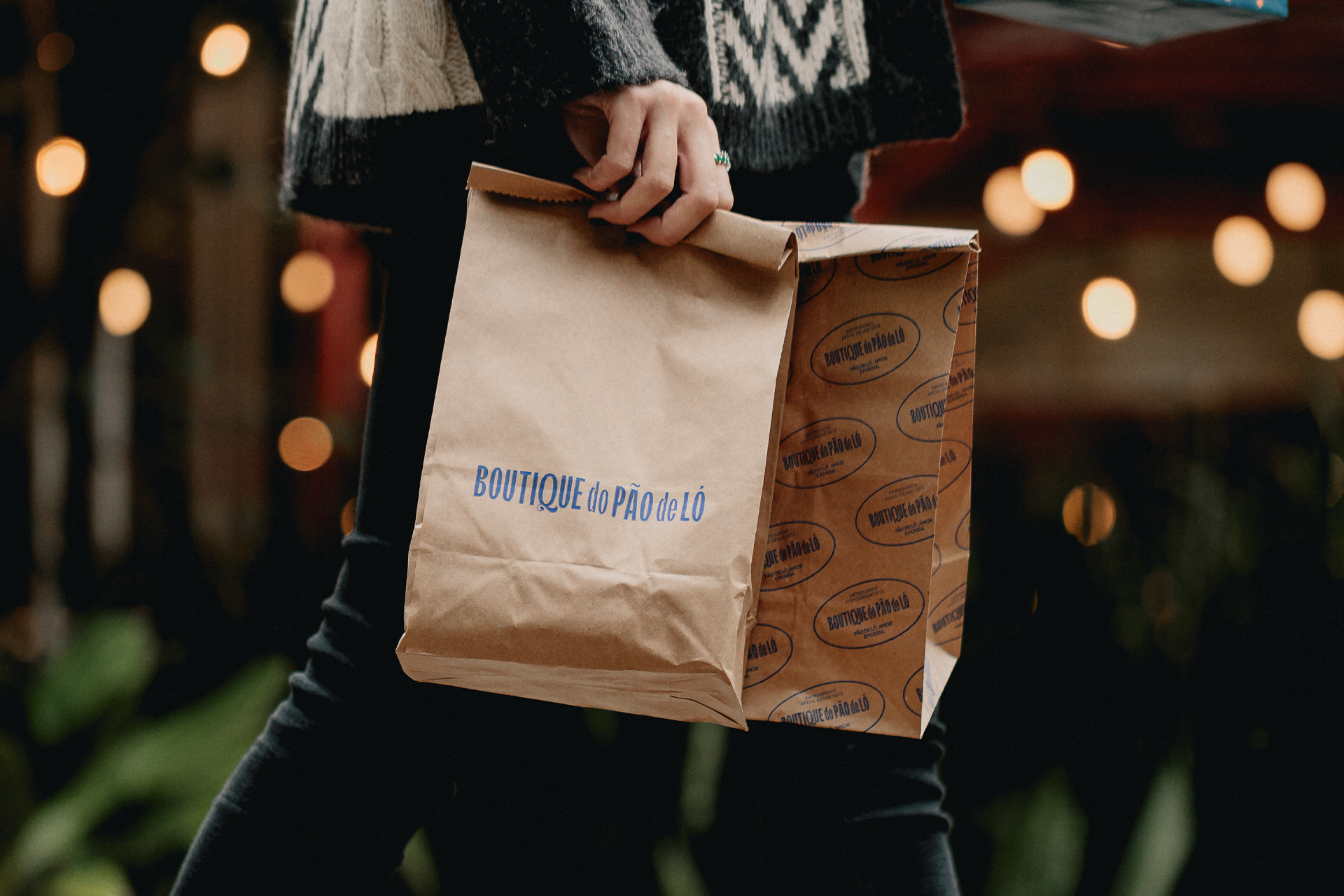
The new identity also features the use of contrasting colors, diverse textures, graphic elements that connect with the sensory world of confectionery, as well as new visual signatures. Everything was designed to make the brand dynamic, replicable, and consistent across different formats of both company-owned stores and franchises.
universo visual expandido
A nova identidade contou ainda com o uso de cores contrastantes, texturas diversas, elementos gráficos que dialogam com o universo sensorial da confeitaria, além de novas assinaturas visuais. Tudo foi pensado para que a marca se tornasse dinâmica, replicável e coerente em diferentes formatos de lojas próprias e franquias.
A nova identidade contou ainda com o uso de cores contrastantes, texturas diversas, elementos gráficos que dialogam com o universo sensorial da confeitaria, além de novas assinaturas visuais. Tudo foi pensado para que a marca se tornasse dinâmica, replicável e coerente em diferentes formatos de lojas próprias e franquias.
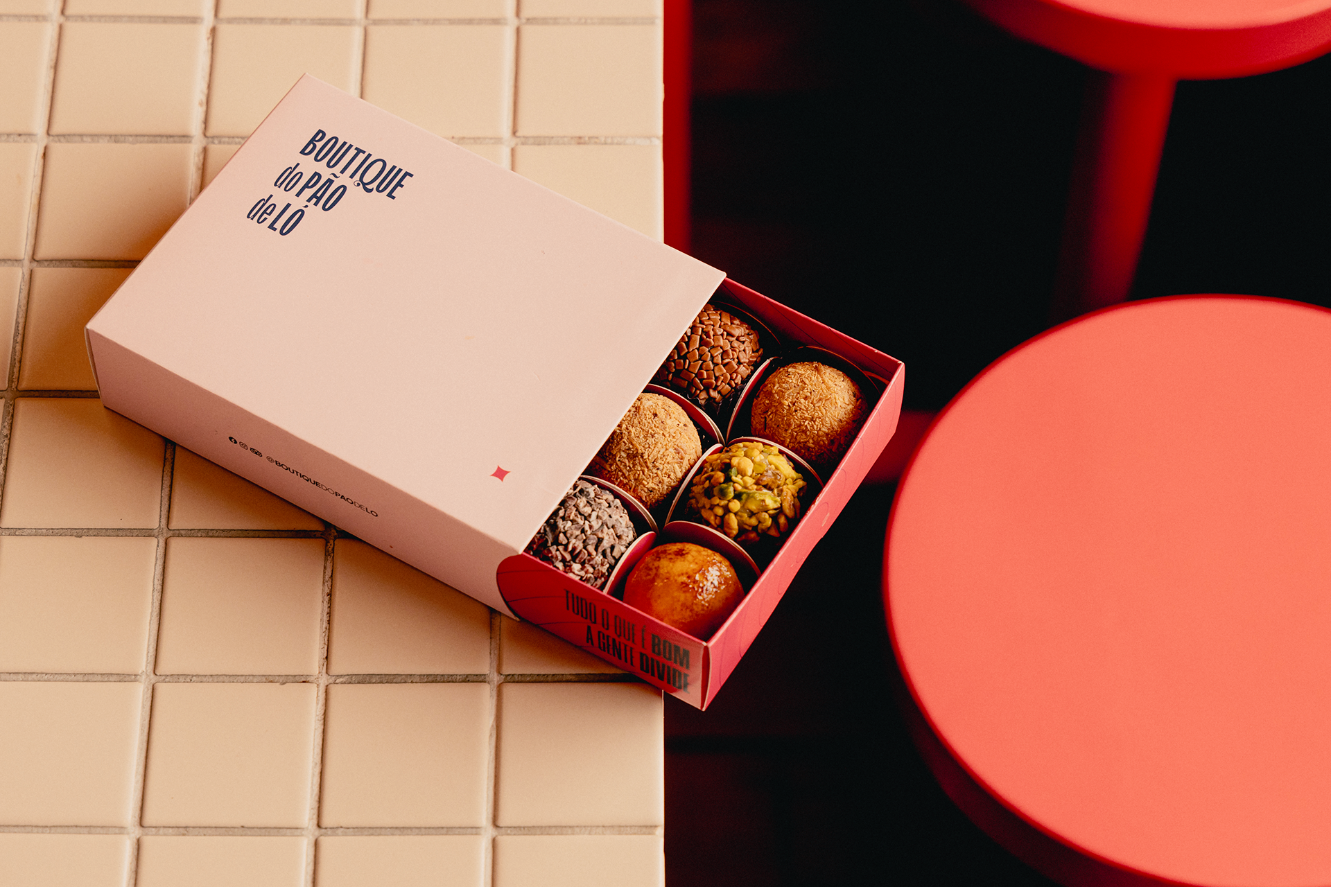
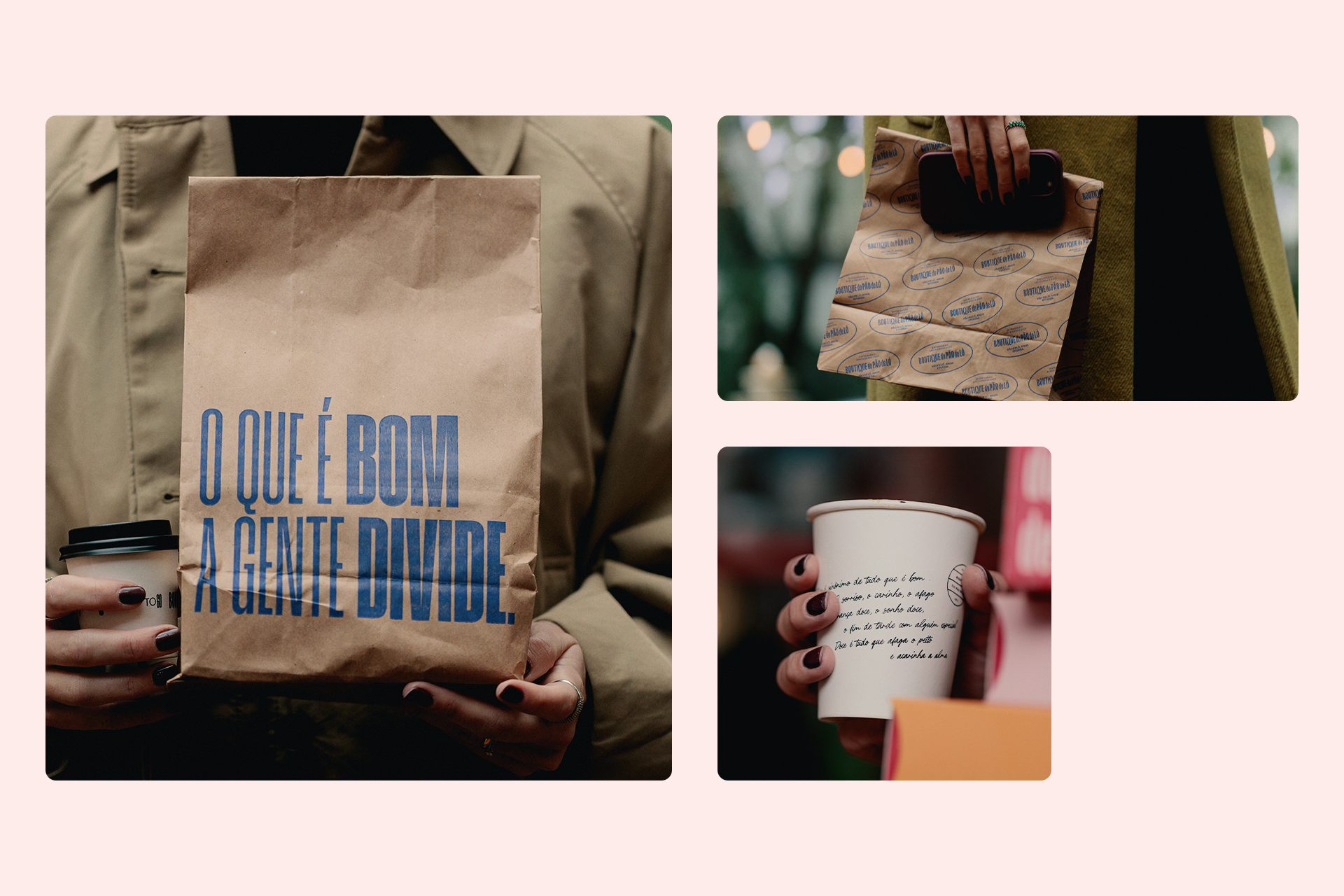
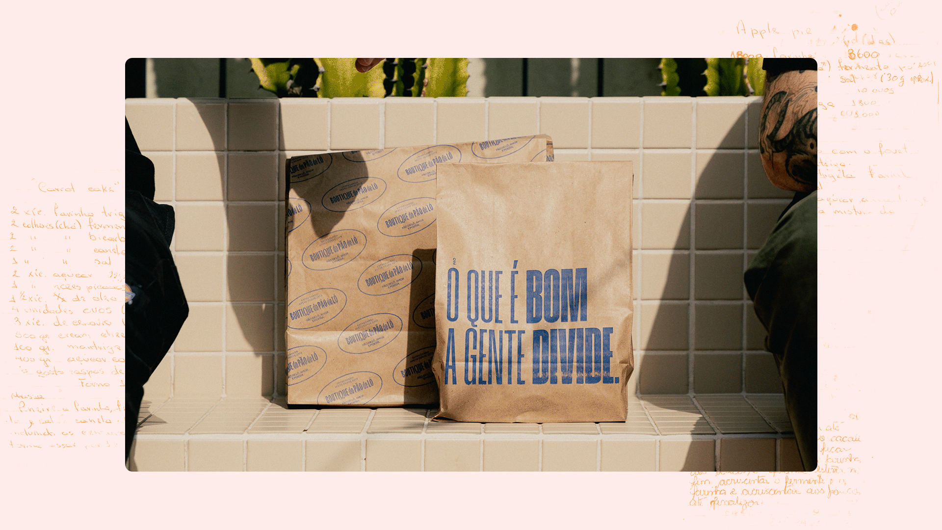
chocolate and poetry
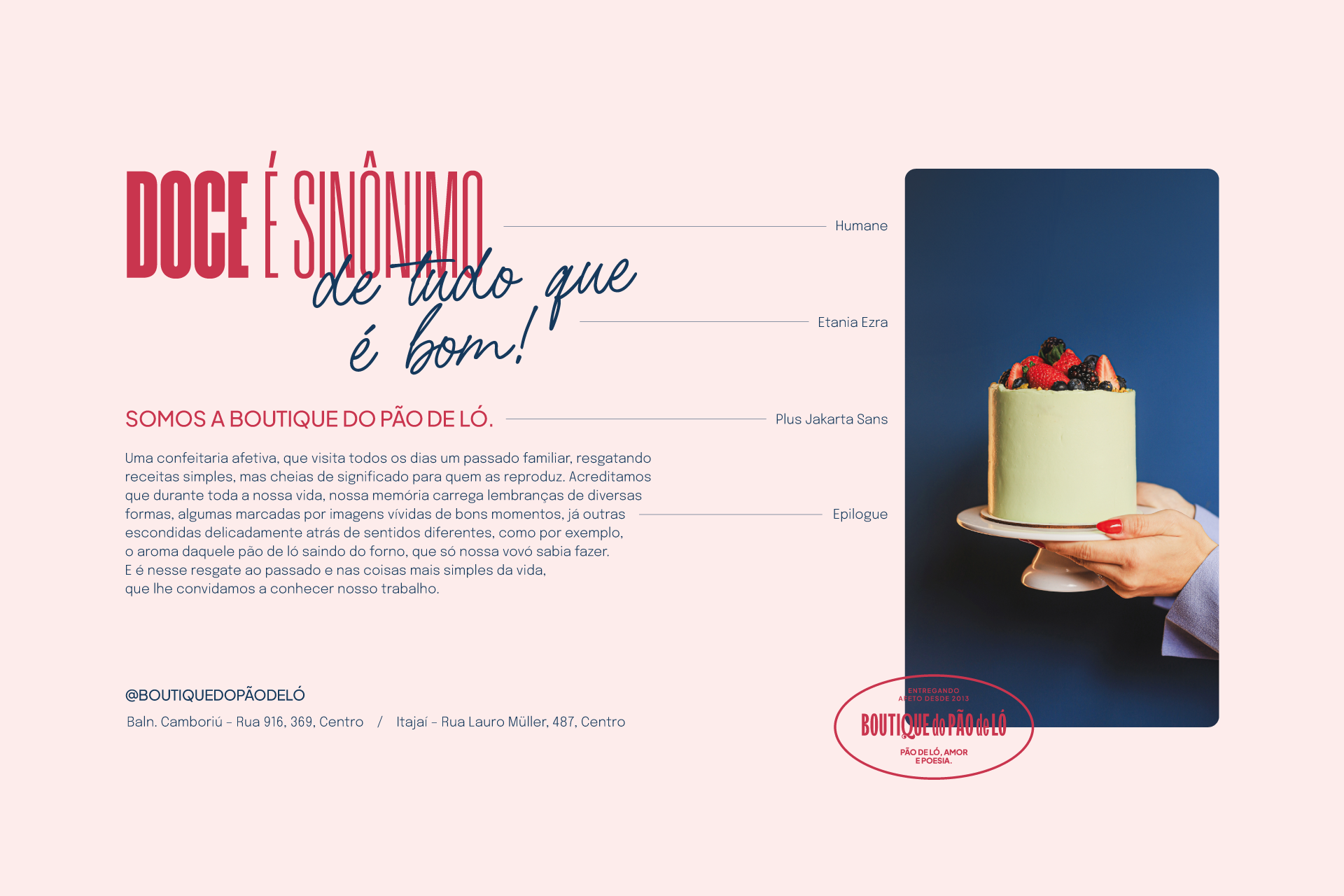
As part of this process, we invited Anderson Sabadini to collaborate on the creation of a manifesto in the form of poetry. The premise was clear: each verse needed to convey its own message and be strong enough to stand on its own.
With this material in hand, we turned the manifesto into a key element of the brand’s visual identity, applying small excerpts on packaging, at points of sale, and across other institutional materials—enriching the brand universe and making it even more expressive and dynamic.
chocolate e poesia
Como parte desse processo, convidamos Anderson Sabadini para colaborar na criação de um manifesto em formato de poesia. A premissa era clara: cada verso deveria transmitir uma mensagem própria e ter força suficiente para funcionar de forma independente. Com esse material em mãos, transformamos o manifesto em um elemento da identidade visual da marca, aplicando pequenos trechos em embalagens, pontos de venda e outros materiais institucionais, enriquecendo o universo da marca e tornando-o ainda mais expressivo e dinâmico.
manifesto
Doce é sinônimo de tudo que é bom
O sorriso, o carinho, o afago
A lembrança doce, o sonho doce, o fim de tarde com alguém especial
Doce é tudo que afaga o peito e acarinha a alma
O sorriso, o carinho, o afago
A lembrança doce, o sonho doce, o fim de tarde com alguém especial
Doce é tudo que afaga o peito e acarinha a alma
É por isso que quando tem bolo saindo do forno a gente chega
E se reúne para dividir
Junta todo mundo para compartilhar
E o cheirinho bom que vem pelo ar leva a gente de volta para o mesmo lugar
E se reúne para dividir
Junta todo mundo para compartilhar
E o cheirinho bom que vem pelo ar leva a gente de volta para o mesmo lugar
Um momento feliz, um dia especial, uma lembrança
Uma receita de família que passa de mãe para filha
Que envolve quem chega, mantém viva a memória de quem se foi
E faz a gente lembrar de como é gostoso viver
Uma receita de família que passa de mãe para filha
Que envolve quem chega, mantém viva a memória de quem se foi
E faz a gente lembrar de como é gostoso viver
Um doce pode mudar a vida da gente mudando apenas um momento, que reverbera e transforma
Colore o dia, enfeita o tempo, embeleza o mundo todo
Doce pode ser um presente que a gente se dá, uma lembrança que a gente cria
Igual sorriso, que acompanha os melhores momentos dos melhores dias
Colore o dia, enfeita o tempo, embeleza o mundo todo
Doce pode ser um presente que a gente se dá, uma lembrança que a gente cria
Igual sorriso, que acompanha os melhores momentos dos melhores dias
E o calorzinho bom que vem do forno esquenta também o coração
Aquece, por dentro e ao redor, encanta os olhos, faz brilhar o sorriso, acalenta o espírito
Bem que a nossa vó já dizia: doce é sinônimo de tudo que é bom
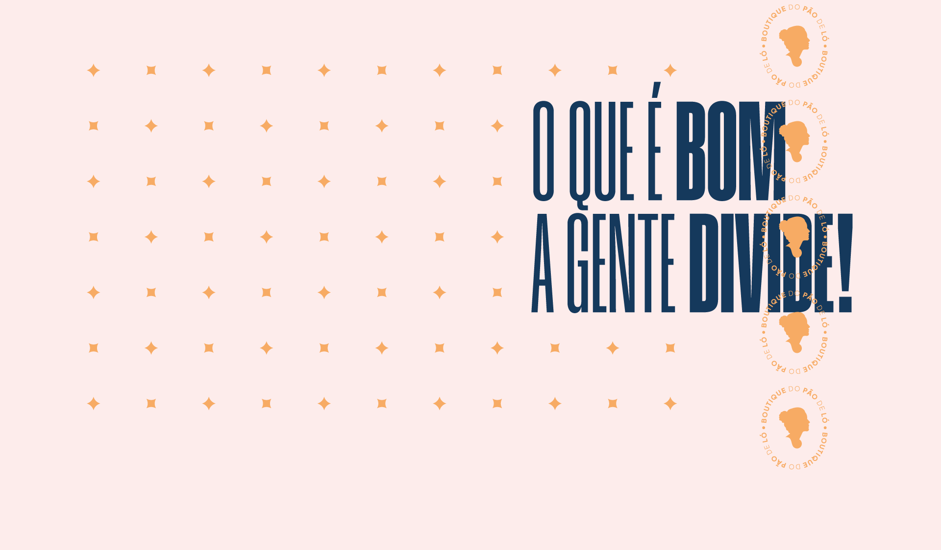
E o que é bom a gente divide.
Aquece, por dentro e ao redor, encanta os olhos, faz brilhar o sorriso, acalenta o espírito
Bem que a nossa vó já dizia: doce é sinônimo de tudo que é bom
E o que é bom a gente divide.
Sweet is a synonym for everything good.
The smile, the affection, the embrace. The sweet memory, the sweet dream, the late afternoon with someone special. Sweet is everything that soothes the heart and caresses the soul.
That’s why, when there’s cake coming out of the oven, we gather. We come together to share. We bring everyone in to enjoy, and the delicious aroma floating through the air takes us right back to the same place.
A happy moment, a special day, a memory. A family recipe passed from mother to daughter. That welcomes those who arrive, keeps alive the memory of those who are gone. And reminds us how wonderful it is to live.
A sweet treat can change our lives by changing just one moment, which echoes and transforms. It colors the day, adorns time, makes the whole world more beautiful. Sweetness can be a gift we give ourselves, a memory we create. Just like a smile, accompanying the best moments of the best days.
And the comforting warmth from the oven also warms the heart. It embraces, inside and out, enchants the eyes, makes smiles shine, soothes the soul. Just like our grandma used to say: sweet is a synonym for everything good. And what is good, we share.
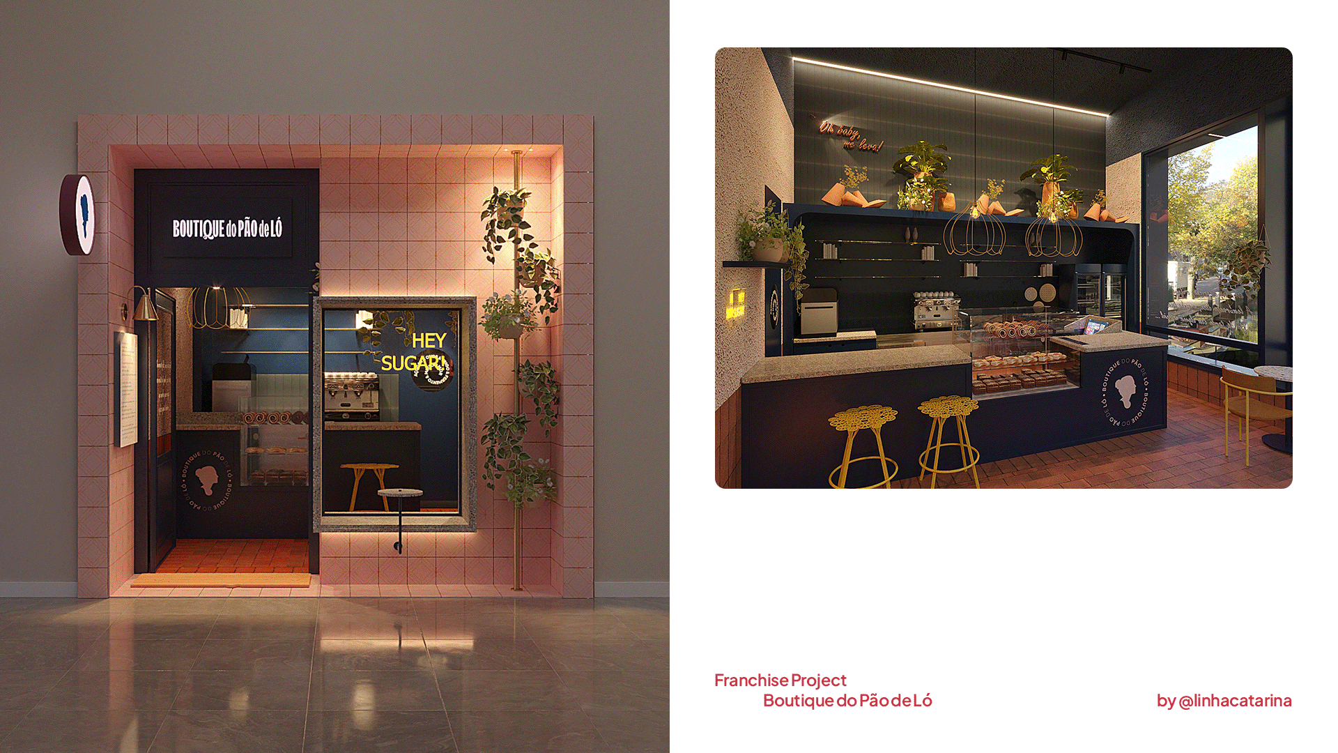
design brought to life
With this solid foundation in place, the architecture firm Linha Catarina was responsible for translating the brand’s visual universe into physical spaces. The projects range from small kiosks to larger stores, all designed to faithfully express the new phase of Boutique do Pão de Ló at the point of sale.
design que se materializa
Com toda essa base consolidada, o escritório de arquitetura Linha Catarina foi responsável por traduzir o universo visual da marca em espaços físicos. Os projetos variam entre pequenos quiosques e lojas de maior porte, todos concebidos para expressar com fidelidade a nova fase da Boutique do Pão de Ló no ponto de venda.
Com toda essa base consolidada, o escritório de arquitetura Linha Catarina foi responsável por traduzir o universo visual da marca em espaços físicos. Os projetos variam entre pequenos quiosques e lojas de maior porte, todos concebidos para expressar com fidelidade a nova fase da Boutique do Pão de Ló no ponto de venda.
If you like this, check our Instagram for more.
DELIVERABLES
Identidade visual / Visual Identity
Identidade visual / Visual Identity
Embalagem / Packaging
Logo / Logo
Manifesto / Manifest
Logo / Logo
Manifesto / Manifest
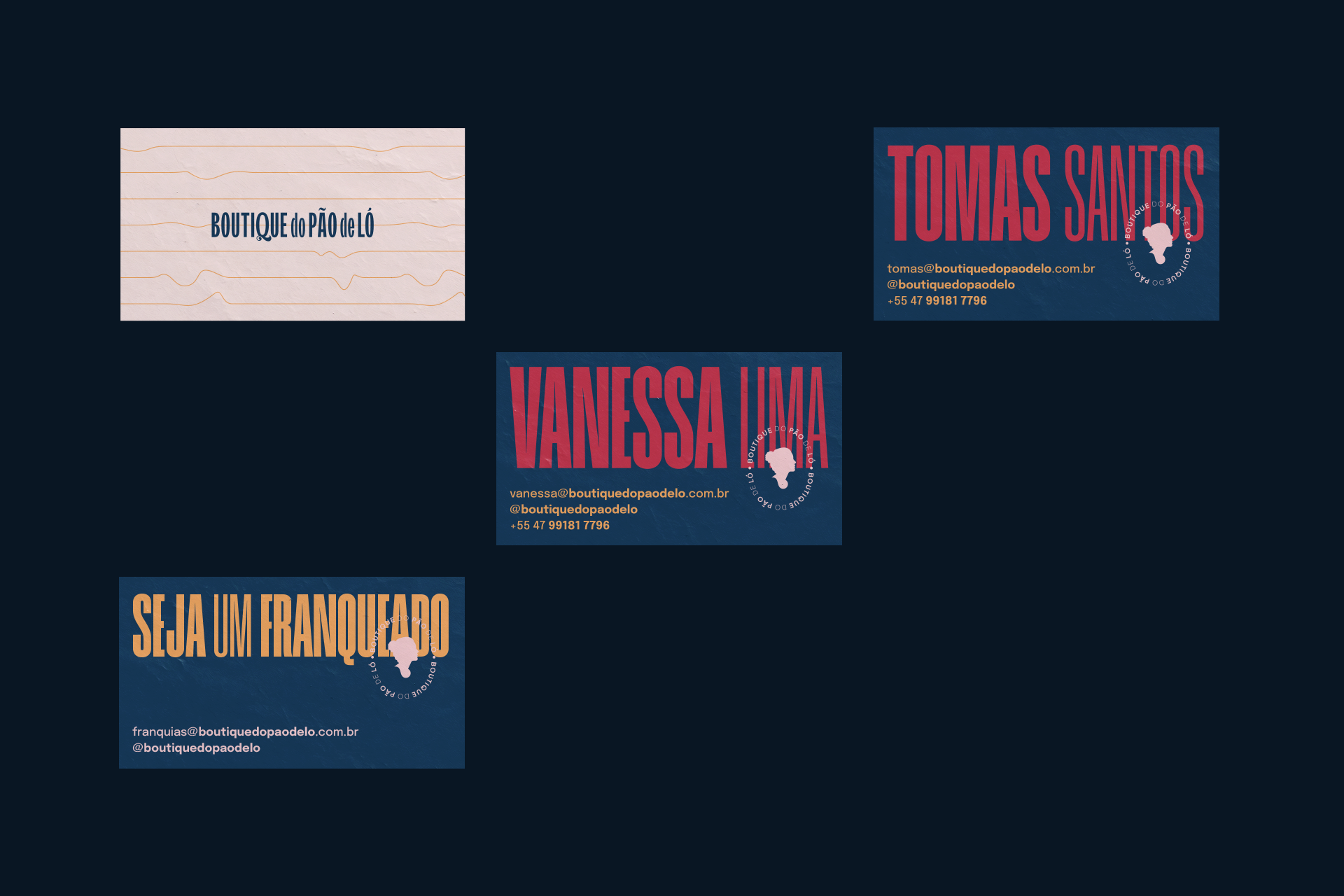
CREDITS
Customer service: Alex Reuter.
Designers: Alex Reuter, Guilherme Rosa e Juliano Jover.
Approval: Vanessa Lima e Thomás.
Manifest: Anderson Sabadini.
Photo: João Pedro Varela.
Narration - Prototype Film: Raquel.
Editing - Prototype Film: Henrique Grandi.
Manifest Film: Leonardo Felippi.
Architecture: Linha Catarina.
Designers: Alex Reuter, Guilherme Rosa e Juliano Jover.
Approval: Vanessa Lima e Thomás.
Manifest: Anderson Sabadini.
Photo: João Pedro Varela.
Narration - Prototype Film: Raquel.
Editing - Prototype Film: Henrique Grandi.
Manifest Film: Leonardo Felippi.
Architecture: Linha Catarina.